Below is the storyboard I did for the SKOL Advert
1.) Couple sat watching a chick flick at home, Girlfriend is crying at the movie
2.) Man is bored
3.) Girl falls asleep, man bored still.
4.) Man thinks back to earlier that Day
5.) His Friend called him up, he says that are going to watch the Match and drink SKOL.
6.) His Friend
7.) He can't go, he chooses to stay at home with his girlfriend to watch a movie.
8.) Man decides to call his friend to see what he is up too.
9.) His friend's house, he has his other mates round. The phone has been knocked off and so they don't have the call come through, a few bottles of SKOL on the side. They drink the SKOL.
10.) No Answer, man sighs.
11.) Tagline: Always Choose SKOL or else. Simple but effective, straight to the point.
Tuesday, 27 December 2011
Wednesday, 21 December 2011
Example: Using Pictograms
I Love BEER Poster
Tuesday, 13 December 2011
Pictograms?
After Peer Assessment
After my peer assessment I've decided to re-think the whole website, I need to go back and re-design it. I don't want to include my own drawn photos of the product as in my images it doesn't show the products completely. I'm going to use an image online of the product and enhance it using photoshop.
My feedback was for my to do more ideas, I need to storyboard an advert, also think of other ways I can advertise Skol.
Sunday, 4 December 2011
Skol Beer: New Image
Wednesday, 30 November 2011
Homepage
Skol Poster
Tuesday, 22 November 2011
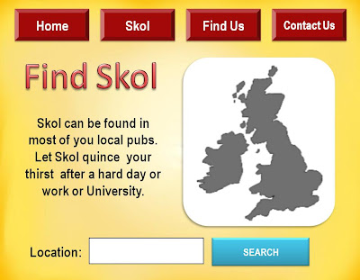
Find Us Page 2nd Draft
Navigation Bar Buttons
Sunday, 20 November 2011
Website: Background
So I decided to create my own background which features the SKOL BEER famous colour, yellow but in different shades so it fades in and becomes bright in the center. It didn't take me long but this is just a draft of what it will finally look like. I like how it fades and is softened completely, I used CORAL PAINT SHOP PRO X for this.
Below is what the background looks like featured on the home page
Skol Web Design (My version)
I've decided to do a website for SKOL BEER, it will feature my own hand drawn images on it as well as information I've researched.
Below are drafts of what my website will look like, I will add more pages if necessary.
The images featured on the drafts are just there to give a preview of what my images will look like, I'm thinking of coming up with a new logo for the beer as well as a new packaging for the bottle and featuring both on the website. The background is a maybe right now, I need to give it some depth so maybe using more than one colour and blending them together using Photoshop.
Sunday, 13 November 2011
Skol Website?
I have considered maybe re-designing a website for Skol beer. However, I was unsure of where I would start and what I would include on the website so I decided to visit the Carlsberg.co.uk website. Below are print screens of the website and my views on the contents.
I liked how you have to enter your date of birth before your allowed to enter the site so it keeps the underage audience out from the site. Carlsberg is trying to promote drinking awareness to keep their targeted audience safe. With Carlsberg I can see that their main targeted audience are football fans, males and I would guess around 18 or 20+ in age.
The homepage is clean and everything is kept together. The main colour is of course green, the Carlsberg green which is present on every page of the website. The homepage is easy to navigate, the navigation bar isn't the main aspect but is still visible on the side of the website.
Like I said before, they target football fans as Carlsberg is a popular drink to have whilst watching a football game. They give off information on games that Carlsberg sponsor.
This page I wasn't expecting, if you put your postcode, town or county into the search bar then it will find pubs around your area who sell Carlsberg. It means that Carlberg fans know where to go to drink as well as maybe watch live football games.
This page gave information on the type of different beers that Carlsberg did and their nutrition guide.
After observing Carlberg website it is clear that some of the information I was going to include on my website weren't even considered on the Carlsberg website. I'm going to have to re-think what I want to include on the website. At this point the website is a maybe, I was going to do a story board of an advert or a poster advertising SKOL BEER.
Tuesday, 8 November 2011
Skol Beer Advert Ideas
I'm trying to target males from the ages of 18+ so even men in their 30's are still targeted but I wanted to make it so it relates to the younger adult audience, especially students.
Ideas
1.) Man sitting at home with his girlfriend, he is in his early 20's. They are watching a chick flick and she is crying at a really mushy bit, the man yawns and checks his watch. He makes an excuse and leaves the room, whilst he is in the kitchen he escaps through the window and grabs a taxi outside. Once he gets to another house he rings the bell and a guy answers, he is holding a Skol beer in his hand, he welcomes him in and they walk into a room with 4 other males all watching football, they cheer and the guy who answered the door hands the boyfriend a boottle as they sit down. Tagline reads. 'Always choose Skol'.
2.)A guy gets a call but we don't hear what is said on the other end, panick shows on his face as he stands from where he has been sitting on a bench eating a sandwich, the sandwich falls to the floor, forgotten. He hangs up and starts running, slow motion in sections. He jumps over a dog being walked, as he rounds the corner he enters a marathon by accident and continues to run along side them, grabbing a cup of ice water and downing it whilst splashing the rest on his face. He continues to run as he comes to a house and opens the door and go to the kitchen. His wife/girlfriend is just about to throw away his Skol beer but he snatches them off of her and turns, going upstairs and into his private gaming room, putting on the TV and watchs the football whilst drinking Skol Beer. Tagline reads, 'You will do anything for Skol'.
Skol Beer
When looking at Skol Beer it has been directed at men who are usually 25+ but I want to make it so it is targeted at Males who are 18+, students as well.
To do I need to ask the question, 'What do they want to see?' on the packaging and the ad. Here is what I came up with:-
- Women
- Fun
- Partying
- Sex
- Life
- Cool
- Lifestyle
- University
- Relaxing
These words are what will grasp the student's attention and make them want to buy Skol Beer.
In the advert or poster (Not sure which one yet) I could have a cartoon woman having her one leg up on the bottle of Skol with a smile and winking at the audience. She can be in a red bikini with either black or blonde hair and pale skin or tanned. This image will be sexy for the male audience, they will think that if they buy Skol Beer they will get a woman who looks like this, that women who look like this only go for guys who drink manly beers like Skol.
A women who looks like this
And This
These two women cartoons are known for how sexy and well dressed they are. I need to come up with my own cartoon which will make men want to buy Skol Beer and it has to link with University so I might have the girl wearing a University Graduation Cap or something.
Sunday, 30 October 2011
Project: Skol Beer
We have been placed into groups of 3 and been given a Project Brief to re-design and advert one of 8 products. Our group decided to choose the SKOL Beer. I decided to first do some research on the beer to get a background of it and see who the targeted audience were originally.
The Beer was created to be a global beer, it was first introduced in 1964. It was popular globally until around the last 1980s. Now it has sort of died out but is the number one beer in Brazil.
Hägar the Horrible (Cartoon) was used to promote it for a while (I don't know this cartoon hardly so I need to look into some adverts that they were used in for Skol).
The Manufacture for Skol Beer is InBev.
Skol does have a website but it is for Brazil so I can't understand the text at all, you also need a password or something to gain access to the site. http://www.skol.com.br
Commercials For Skol Beer
http://www.youtube.com/watch?v=Vc4S3xk0EFw
http://www.youtube.com/watch?v=ZZQhVXsGSyM&NR=1
http://www.youtube.com/watch?v=D5uDG4_cDPo
http://www.youtube.com/watch?v=oCPop09XvcY
Most of these aren't in English which shows that SKOL is more popular internationally that it is in the UK. I however want to make it so it is popular in the UK, I need to direct my re-designed product toward the British people and make it popular and enjoyable for them.
By watching the adverts its clear that the targeted audience for Skol Beer would have to be Males, between the ages of 20+ I can't really put an age range on it as in some adverts it shows people around the age of 23 and in others it shows men who are in their 40s and 50s.
Posters and Pictures of Skol Beer
There is a pattern with some of the poster adverts for Skol Beer, it seems that women have been used in the adverts to gain the male audience's attention. The humor in the adverts can seem offensive to women but to men it will make them laugh.
Now that I have done some background research on the adverts and the information for Skol Beer I can start to plan what I want to do with the packaging and advertising of the beer. I'm going to start with re-designing the packaging of the beer and then move on to how I'm going to present this in either an advert or a poster. The main colour palette I need to stick to is the bright colours such as the famous sunny yellow they use in most of the adverts and posters. I need to make it more modern to 18+ in the UK.
The Beer was created to be a global beer, it was first introduced in 1964. It was popular globally until around the last 1980s. Now it has sort of died out but is the number one beer in Brazil.
Hägar the Horrible (Cartoon) was used to promote it for a while (I don't know this cartoon hardly so I need to look into some adverts that they were used in for Skol).
The Manufacture for Skol Beer is InBev.
Skol does have a website but it is for Brazil so I can't understand the text at all, you also need a password or something to gain access to the site. http://www.skol.com.br
Commercials For Skol Beer
http://www.youtube.com/watch?v=Vc4S3xk0EFw
http://www.youtube.com/watch?v=ZZQhVXsGSyM&NR=1
http://www.youtube.com/watch?v=D5uDG4_cDPo
http://www.youtube.com/watch?v=oCPop09XvcY
Most of these aren't in English which shows that SKOL is more popular internationally that it is in the UK. I however want to make it so it is popular in the UK, I need to direct my re-designed product toward the British people and make it popular and enjoyable for them.
By watching the adverts its clear that the targeted audience for Skol Beer would have to be Males, between the ages of 20+ I can't really put an age range on it as in some adverts it shows people around the age of 23 and in others it shows men who are in their 40s and 50s.
Posters and Pictures of Skol Beer
There is a pattern with some of the poster adverts for Skol Beer, it seems that women have been used in the adverts to gain the male audience's attention. The humor in the adverts can seem offensive to women but to men it will make them laugh.
Now that I have done some background research on the adverts and the information for Skol Beer I can start to plan what I want to do with the packaging and advertising of the beer. I'm going to start with re-designing the packaging of the beer and then move on to how I'm going to present this in either an advert or a poster. The main colour palette I need to stick to is the bright colours such as the famous sunny yellow they use in most of the adverts and posters. I need to make it more modern to 18+ in the UK.
PhotoShop - Basics
I have used Photoshop before but never past the basics and even then I don't know much. I often used to simply play around with it when I got the chance and was never taught past the basics by anyone so I taught myself how to change hair colour and eye colour but this was just simple things I did.
We were given a task to change a picture given to us and make it brighter and bolder than the original. I thought this would be easy but in fact I found it to be hard due to using a MAC as well and not a PC which is what I have used Photoshop on in the past.
Below are the stages I went through to complete the task.
Cropped The Images, Straightened It.
Auto Colour, Used Shadow/Highlight Tool.
Used Histogram Tool, Played around with the Shadows and Highlights some more, Auto Contrast.
Used The Dodge Tool.
Used The Sponge Tool.
Used the Unsharp Mask Tool.
And DONE!
It took me a few tries to try and get the picture looking right and even now I'm still not happy with it. Its too sharpened and doesn't look realistic, I need to try and practice more on improving and developing images on Photoshop but it was a good try.
Subscribe to:
Posts (Atom)